Visual stories, integrated tools and a language that speaks the language of matter
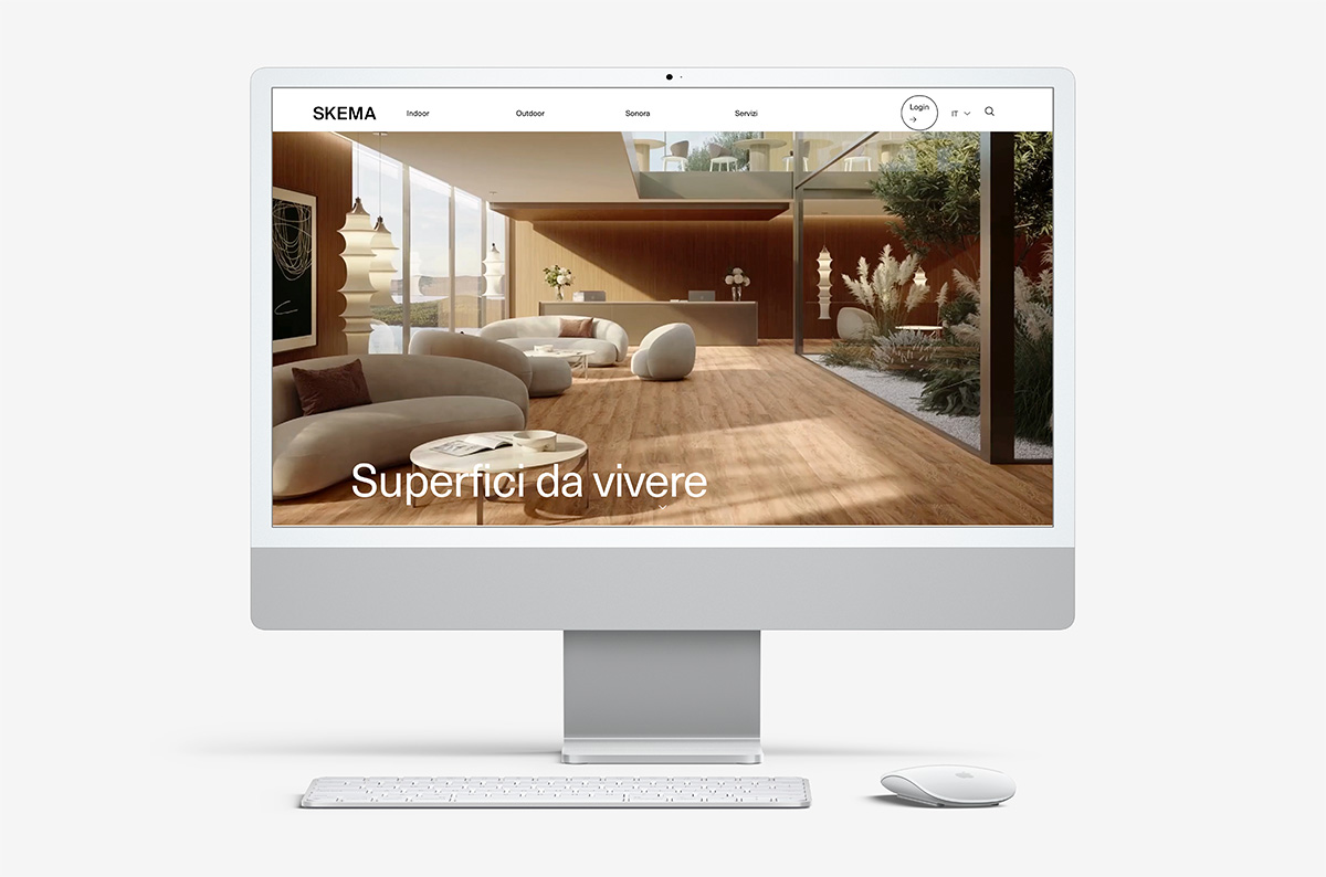
Skema’s new website is online: the access point to a completely redesigned visual and narrative system, born from a specific need – to coherently express what Skema is and how it works. This is not a simple aesthetic revamp. The intervention is structural: it concerns visual identity, language, tools, and the relationship between content and function. It is communication designed not to impress, but to be useful.
The website: architecture and readability
The new website is essential, linear and functional. Navigation is intuitive, and the structure is built around the logic of the project: materials, collections, finishes and application contexts are immediately accessible. Every image is true, every content has a purpose. The collections open with direct galleries, downloads are simplified, and selected projects are integrated into the visual narrative without overloading the interface.
Graphic and symbolic excesses have been eliminated. No decorative frills, no interpretative filters: the material is shown as it is, with precision and respect. The lexical choice follows the same direction: dry, technical where needed, descriptive where necessary, never redundant.
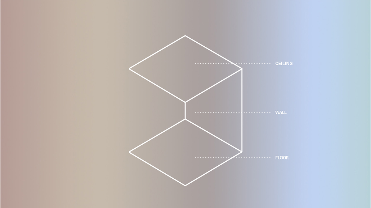
Palettes as visual stories
One of the most effective elements of the new coordinated image is the introduction of a functional colour palette. Each area is associated with a specific shade, selected for its perceptive quality and symbolic value. Colour thus becomes a guidance system that runs through the website, catalogues, samples, displays and packaging.
It is a coherent visual grammar that discreetly accompanies the user without driving him by force, strengthening the readability of the offer and the recognition of the collections. A subtle code that improves the experience and enhances the materials.
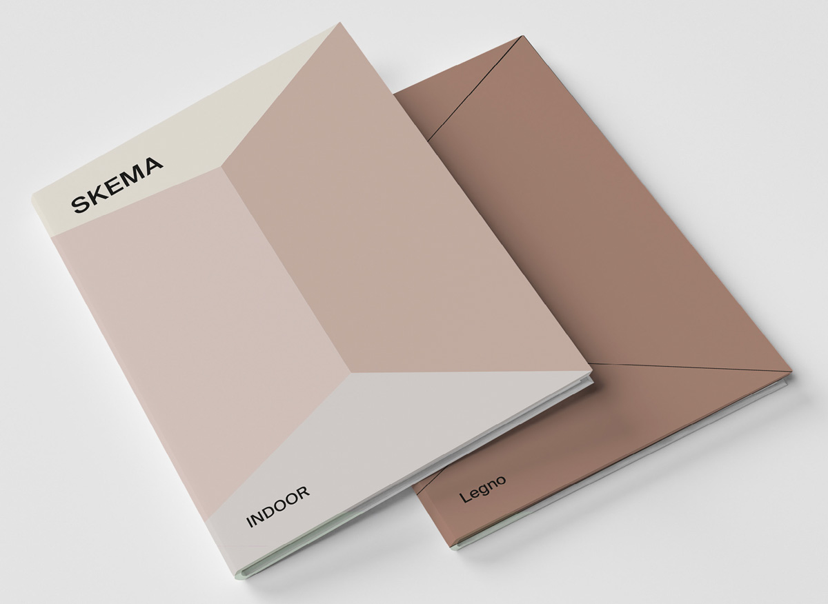
Tools designed for the project
Alongside the website, the new image extends to editorial and commercial tools: new catalogues, which can be broken down into monographs for direct use by architects and designers; integrated digital media, essential technical data sheets, and videos dedicated to installation and maintenance.
Everything is built with the idea of simplifying, in the truest sense of the word: removing the superfluous to bring out the essential, like a sculptor who works by subtraction and allows the form to emerge.
Particular attention is also paid to the retail sector, where consultation quickness, clarity of information and consistency of image become decisive tools for enhancing the shopping experience and supporting sales activities. With this in mind, each support is designed to facilitate dialogue between the product and those who offer it, making the narrative immediate, fluid and consistent with the brand identity.
Even surfaces become communication: 1:1 scale sample kits, material containers, modular displays. Skema’s physical presence in showrooms or trade fairs is no longer conceived as a showcase, but as a coherent extension of its approach.
Transversal communication, without noise
The new structure also includes a review of external communication: targeted campaigns, digital tools, editorial content and a presence strategy that prioritises the real product experience, from the sound of silence (Sonora) to the durability of outdoor materials.
“Surfaces to live on”, a message that translates into a more direct, more material language, closer to those who design spaces and relationships.
A choral narrative
A multi-voiced story that expressed the richness of a choral project.
